Question 1: In the UK film market, an increase in the number of screens available to show films has not led to an increase in the number of films being shown. Why?
The increase in number of screens available to show films has not led to an increase in number of films being shown because even though there are more screens available to show films there is a finite number of films people will see per year, the demand will not increase due to the supply of screens rising unless they provide something like an successful advertising campaign. Another valid point is that there is such a large amount of films produced and the audience are not going to have the desire to see every single one, in fact, films outside the main Hollywood "blockbuster" that does not have the advertising or financial backing from of Hollywood are unlikely to attract the extra viewer, there are therefore a finite number of films that will bring an audience to the cinema.
Question 2:
Which top 10 films in the US last year made two-and-a-half times their budget?
1. Harry Potter and the Deathly Hallows Part 2, 2. Transformers: Dark of the Moon, 3.Twilight: Breaking Dawn Part 2, 4. Hangover II, 5. Pirates of the Caribbean: On Stranger Tides, 6. Fast Five, 7. Mission Impossible: Ghost Protocol, 8. Cars 2, 9. Sherlock Holmes: A Game of Shadows, 10. Thor
Important link with between audience results of the survey and a creation of character. Target audience enjoyed 'Silence of the Lambs', 'Donnie Darko' and a series like 'Dexter' - the loveable psychopath.
Woman:
Victim, young (early 20s). attractive - in a youthful innocent. eg Natalie Portman
Man:
Killer - casual about killing; a casual mastermind psychopath in the style of Hannibal Lecter, Jack Torrance, the narrator in Fight Club, heath ledger (joker), kitano (battle royale)
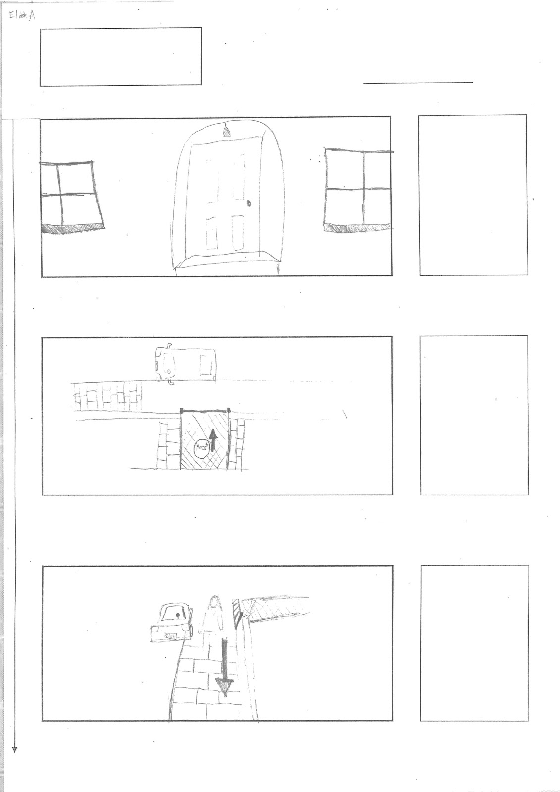
Dark tone with shadows - psychological thriller which depicts a two-faced character. Urban landscape - concrete jungle, gritty feel with images of such things as concrete underpasses and high-rise low grade concrete estate.
It is important to build a sense of nervous tension for the audience - through a range of devices such as sound (both atmospheric, diegetic and perhaps moments of silence). Perhaps some contrapuntal sound to jar with the images of dilapidation. -EA
In 'We Need To Talk About Kevin', her flashback imagery is brutally evocative of the gorier parts of the film, and so the colours and the feelings they evoke make the aesthetics particularly powerful.
The difference between dream and reality should be heightened so that tone is established clearly through colour.
The dream sequence should be full of light and a covered with a gauzy veil of warm, almost psychedelic colour. It will seem as if all senses are heightened, and so Margot's dreamy encounter with Eva is still intense.
However the awake aspects of Margot's life are dull in contrast, possibly tinged with monotonous, gloomy blue.
MARGOT - Margot's personality and mannerisms draw reference from neurotic and unstable intellectuals such as Winona Ryder from Girl Interrupted, or Natalie Portman's character's distorted relationship with her mother and subsequent need for attention in Black Swan. Both characters are insular and affected, and as the films progress this is also noticed by other surrounding characters who start to treat them differently.
However aesthitics wise we would want to resemble the gamine, pale and ghostly blond look of actresses such as Mia Farrow and Sissy Spacek.
-SL
We asked Kathy to be out actress for Margot because we thought her pale skin and long blonde hair would be nice contrast to the more darker colouring of out other female character Eva. She also lives close to our filming locations so it would be convenient for everyone in the group.
Profile: Margot is an anti-social, independant teenager who feels removed from what she considers normal life. She is very distant towards her mother, who she lives with, and has no close personal relationships with anyone else. However, she is constantly fascinated with some people and spends most of her time observing everyday life, while herself feeling she has become an outcast from it. These inclinations will lead to her obsession with Eva and their destructive, distorted relationship.
Character Appearance + Personality:
We bassed the appearance of Margot on Characters like the sisters from theVirgin Suicides, especially Kirsten Dunst, and other actresses such as Amanda Seyfried and Mia Wasikowska,with pale skin, long blonde hair and blue eyes. We thought this would give her character the impression of being innocent and easy to influence, as these features are commonly assosiated with that type of character.
Her personality was also inspired by the sisters in the Virgin Suicides, as they are at first innocent but are eventually influenced to commit suicide together. Another character that se could identify with is Nina from Black Swan, as she is also influenced and eventually driven mad due to the presence of another character in the film.
-GP EVA - She is the enigmatic. engaging and beguiling counter part to Margot's character - The Angelina Jolie of Girl Interrupted or Mila Kunis of Black Swan. We wanted her to have dark and tan colouring so she could be a visual opposite to he character of Margot; another reference to the bipolar aspect of our film.
Margot: Margot is seen as the typical plain and simple character. Her costume will reflect this by being as minimal as possible with detail, but revealing certain aspects of her personality. She can't afford expensive clothing, so the main staple of her outfits will be her khaki parka, as the film is set in winter and she will be wearing this most of the time. Other features will be simple T-shirts and and jeans, always in dark or neutral colours with no patterns or intricate detailing. This will emphasise how naive and transparent she is at the start of the film; perhaps later in the film her costumes will evolve due the the drastic changes Eva causes in her personality. This costume for the opening will also contrast well with Eva's flamboyant style. She will also almost always wearing old,black boots. The factors combined will give her character a precise continuity through her aesthetic on the opening scenes and further in the film.
Eva:
Eva's character is much more flamboyant and in a way, self aware than Margot. She feels the need to assert herself over others because of her own insecurities, and this is projected through her costume. During the dream sequence, emphasis will be on the detailing of the clothing i.e. patterns, intricate detailing and bold colours. There will be no main focus of the character as in Margot, showing the erratic and changeable nature of her character. It may also suggest how she tries to distract people through her looks and sycophantic tendencies, whilst hiding her true dark, manipulative personality.
The sound of musical glasses could fit really well into the dream sequence. It has really god ethereal tones that could emphasise the dream for the audience. This mixed with diegetic sound of animals or wind could produce a nice mixture of sound which shows the break in reality during the dream, and increase the ambience of the sequence. It would be unlikely that we could find a track that suited our scene, so will will probably have to record our own track to play during the dream.
Everything in its Right Place by Radiohead:
I think that the the song everything in its right place is an iconic song and it would add tremendous value to the opening sequence, the dream sequence. This kind of music would be ideal as it is surreal and the dream sequence is supposed to be all about the "unreal" and the abnormalities that we don't really notice much in real life.
-E.A
Morning Sequence:
Both Black Swan and Shame use string music over scenes to create ambience. I couldn't find specific scenes on youtube, but the trailers feature the same music. This could be used to create tension in the sequence when Margot goes outside, still including diegetic sound but them music will be emphasised. The music is also used in the films for characters that have a certain obsession or mental problems, which would work well highlighting Margot's obsession with Eva and her mental issues.
Travel Sequence:
The opening to collateral effectively shows what i want to do with the sound during the scenes in the house and the street. There is still some atmospheric sound of the airport, but the sound of the footsteps has been amplified so you can hear them above the other diegetic sound. This creates a good effect as it highlights the character Tom Cruise is playing and draws the audience attention to him and what he is doing. If we were to use this in our opening, it could highlight the importance of Margot's character and sound good.
The opening credits are crucial and must be exactly as we want them. There are a variety of different ways in which they can be displayed and I would like to show a few examples of opening credits to give light on a couple of ideas I would like to use. Dexter:
The opening to the series Dexter is intense, it is very ambiguous and suggests multiple different meanings. However I would like to focus on the written graphics of this introductory sequence and highlight its strengths and weaknesses.
The idea of using a simple text is good because we need the audience to not be overloaded by the text and the video at the same time. This is important because if the audience is taking in to much information then they will find it hard to understand or follow the introduction. This means that using simple text such as Arial will be good because it will give the viewer a clear text which is easy to read. The text is in red which is a good idea because it is obvious symbolism for blood, however there is a lot of red in the video which means that the audience may not be able to focus on both at the same time. For this reason I think i would like to use a more standard colour such as black or white because it makes the text easier to read.
Skyfall:
The credits for skyfall are very strong because they are so simple and have such a high contrast to the film. This is desperately needed because there is so much going on in the video that if the text was not very visible or too powerful then a lot of effect could be lost. The text is in a simple format; white colour and a simple font. The text is sometimes displayed at angles to suit the artistic side of the video, the titles are still very central because they do need attention. Even though they are very central it does not steal the attention as the video and titles work in tandem, the video tends to tone itself down when there is something to read. This is a good technique as it guide the viewers on what to focus on. I would like to use the video contrast between the colour in the video and the text to our advantage during our piece as it is a good way of presenting the titles.
-EA
The title sequence will commence as Margot gets out of bed and starts to go about her day. Graphics should hover around her in different corners to of the screen, so as to be noticeable but not the main attraction. The font should not be garish in anyway, but instead minimalistic, in white Bell MT font. The font is simple and straightforward, but still somewhat feminine with it's soft curves.
The main titles of Dreamcatcher (2003) and Red Lights (2012) also have a simple concept and font design, but manage to blend and compliment the background whilst not being a tangible part of it.
I also like the tinged colour palettes of both sequences as they suggest a darker substance for the film.
Fathom (1967) has a much brighter colour palette but it's placing of the titles around the movement of the character is effective.
I have been researching different idents to get a feel for the ident I would like to use. I will discuss the sound/movement/image/name of the idents and decide wether I like them.
My first example is an ident from the company Perceptireel Pictures. http://www.youtube.com/watch?v=qLg5NzRYLQs
This ident is interesting because of its feeling of "ruggidness". The grainy effect and the images being quite smudged make the ident seem rather gritty. Moreover the rubix cube idea is great because it makes alot of action which is surprisingly simple to concentrate on, the images which play on the rubix cube relate to the company which is about images and films hence the eye and the reel being the main focus of the images on the rubix cube. Also the colour scheme is black and white, this makes the image simpler and the audience are more receptive to it. The music for this ident is good because it is powerful but low key keeping the viewer interested in the actions. Finally i like the name because it is a play on words, the word perceptireel is a mixture of perception, real and reel which I find clever and I quite like in an Ident name. Next i would like to discuss The Weinstein Company ident. http://www.youtube.com/watch?v=mRVh_8y2CAQ
This ident is shorter than the Perceptireel pictures ident, I prefer the ident being shorter as people might get bored looking at an ident. However the weinstein company is not only shorter but much simpler, it starts by making three downward shaped triangles appearing in descending order. Then the name of the company appears, the simple colour scheme is great because it means the audience is not going to have to concentrate too hard. The sound is gentle and uplifting which promotes the weinstein company in a positive way and gradually crescendos till the end of the animation.
An ident that I dislike is the Island Pictures animation.
http://www.youtube.com/watch?v=9iGbu-x1qJ0
I do not like the island picutres animation because it does not seem to have any correlation with the title name. Admittedly it is abstract and I do quite like that aspect of it but i feel it should be abstract within boundaries, however the randomness i find there is too much colour and you have to strain to watch the ident. A positive aspect of this ident is the music, it is slow and melodic which has a nice ambience and makes the audience relax. In conclusion, I would like my ident to be simple and short. This is because i don't want to overdo the atmosphere and the ident should be memorable but not too imposing. Moreover I would like to make minimal movement so the viewers do not need to focus too hard. To achieve this I would like to make my ident in black and white, an example of this would be the Weinstein company's ident. I like the simplicity in colour as opposed to that of the Island Pictures, there is a large contrast between the two idents and I would be worried that I go too overboard with an ident similar to Island Pictures animation. For Movement, I think that movement is key but it must be subtle and slow. The rubix cube is a smart idea however it is too powerful or bold. I would like to use a some shapes and maybe just move them, maybe create a tessellating pattern like -
This will be simple and inspiring, for the name of the company I like to have a clever play on words much like the first example ofperceptireel pictures another good example of this is an independent company called layZeye, this type of idea is interesting and engaging. Music wise I firmly believe that the music should be empowering of sort, the weinstein company have very uplifting and motivational music which i believe promotes the ident greatly. However the island pictures music is soft and quiet which can possibly be used to their advantage.